We visited the London studio of Mark Farrow, designer for the Pet Shop Boys, Spiritualized, Manic Street Preachers and other bands and brands, and found out how he started his career in record shops and the legendary Factory Records in Manchester.
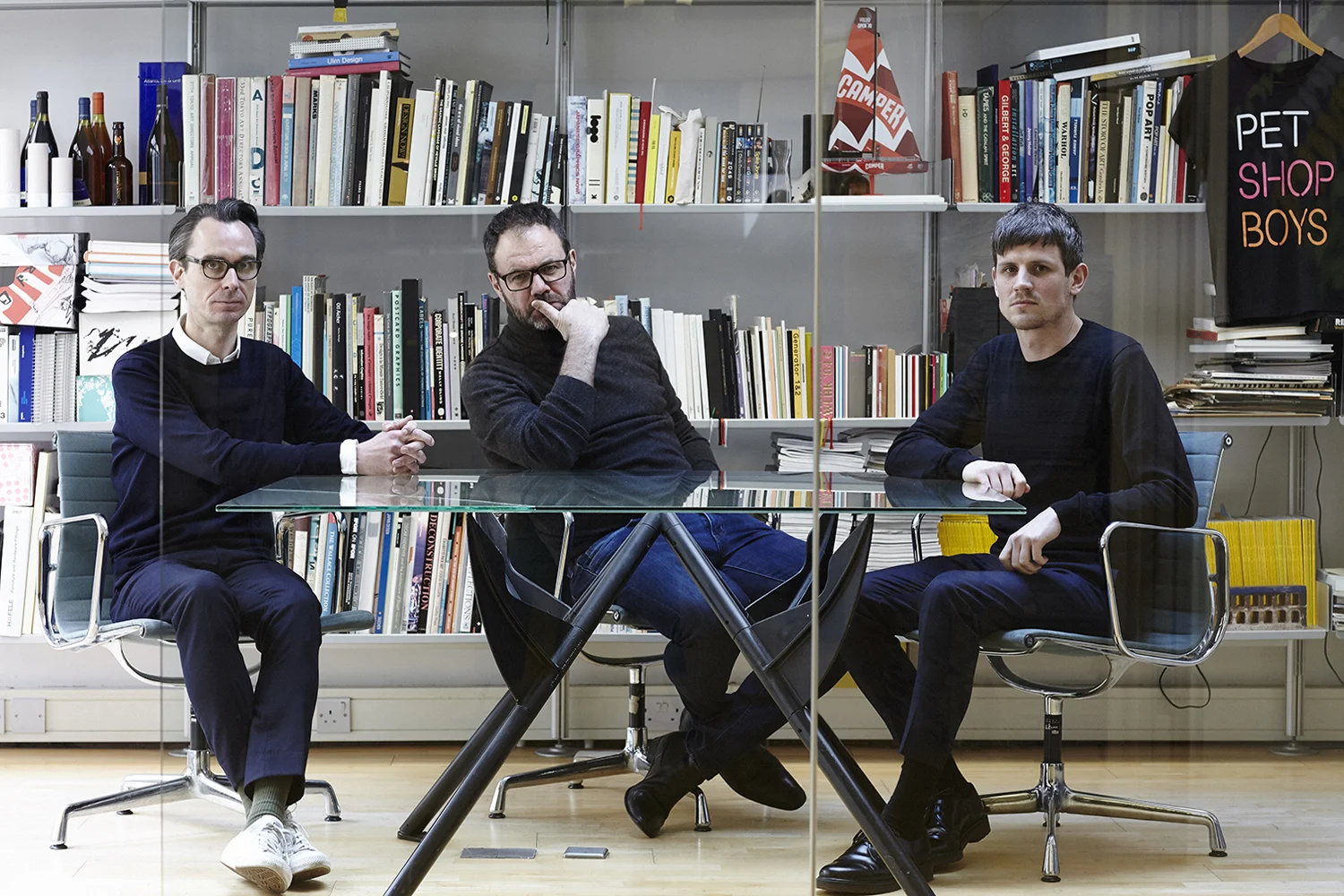
From left: Gary Stillwell, Mark Farrow and Fred Ross of Farrow Design in their studio, Bloomsbury, London, March 2016
Studio Visit
Farrow Design
We visited the London studio of Mark Farrow, designer for the Pet Shop Boys (whose new album Super launches today with B&O PLAY as audio partners), Spiritualized, Manic Street Preachers and others, and found out how he started his career in record shops and the legendary Factory Records in Manchester, and his work with bands, brands and artists.
| CONTRIBUTORS |
| PHOTOS: ELLIOT KENNEDY |
You've worked with bands, brands and all types of companies and people. But how did you start out as a designer?
I was always drawn to the way things look. This began to manifest itself as a teenager when I really started to enjoy music. I was never going to be a musician but that couldn't stop me from designing record covers for them.
I grew up in Manchester which is hundreds of miles from London, where the music business was. My chances of getting to work with musicians were pretty slim in theory, but I was lucky because Punk happened. It was short-lived but Punk’s spirit of independence meant that bands and small labels appeared up and down the country, and I had what I believed was the best one of all to aim for: Factory Records.
I was about eighteen years old then and working for small ad agencies and design companies doing dull work. But at the weekend I worked in a small record store, the unremarkably named Discount Records. It was a tiny shop with walls covered in home-spun indie record sleeves. Small as it was the shop was kind of the centre of the universe for anyone into music then. Tony Wilson, who founded Factory Records, along with Rob Gretton who managed Joy Division (later new Order), as well as designers Peter Saville and Malcolm Garrett all used to frequent the place, so it was a real hotbed for me as a kid. I had formed friendships with lots of the ‘customers’ (we were all just hanging out really) and a bunch of them formed a band, The Stockholm Monsters. They were offered a deal with Factory so they asked me to design the cover for their first single, Fairy Tales, and that was it, I was up and running!
You've worked with Pet Shop Boys on their new album, and have worked on many of their previous albums and tours. How did you end up working with them?
The work I was doing for Factory was an amazing experience and gave me a real sense of freedom and a belief that I could achieve anything I wished, given the opportunity. But at the same time there wasn’t enough work to sustain a career. I hated what I was doing at my day job and realised I had to move to London to be able to get the work I wanted.
So I applied for a job with a London-based design company called XL. They were hot at the time designing for the ZTT label and Frankie Goes To Hollywood.
My folder of flyers, posters and Factory single sleeves did enough to get me the job and I moved to London. XL was an interesting set up inasmuch as it had three divisions: design, film and music management. The latter was run by Tom Watkins and he had recently signed a band called Pet Shop Boys. He felt they would like the minimal aesthetic of my work, and he was right. The first thing I worked on for them was a 10 inch remix sleeve for “West End Girls”, which went on to reach number one in the charts (not because of my sleeve I hasten to add).
Obviously music is a very important part of your personal life. How important is listening to music in your creative process?
Music’s constantly playing in the studio, so it’s very important in that respect – I’m not sure we’d manage without it!
In terms of it relating to a project we are working on, it’s always good to hear what it is that you’re designing for. A concept for an album’s design can come from the music but it’s just as likely to come from the album’s title or a conversation with the artist. When we did the packaging for the Spiritualized album, Ladies And Gentleman We Are Floating In Space, the idea came from something Jason Pierce from the band said in our first meeting: that music was medication for the soul. We designed the album to resemble oversized prescription medication packaging, with each of the 12 songs contained in their own three-inch CD. These had to be popped through foil in a vacuum formed tray in order to play it, so it was literally like taking a headache pill. Ideas can come from anywhere.
““It’s all about the strongest idea, not whose idea it was.””
How does working with musicians and performers differ from other projects you’ve worked on?
Different types of project will always present different sets of problems and we deal with those appropriately. Music projects are the same as they have a unique set of problems, just like all other projects.
I suppose the biggest difference is the egos! Working with musicians can, on occasion, be problematic. If they have direction and you are being pushed as a designer then that’s good, but if it’s somebody just disappearing up their own backside then that’s a problem. For the most part I’m pleased to say that isn’t the case. Pet Shop Boys are a good case in point, they often arrive with an idea, but if we have a better idea then that is the one that we go with (or vice versa). It’s all about the strongest idea, not whose idea it was.
There's three of you working together here. How important is collaboration in your work?
It's important on every level. It starts in the studio. There’s three of us – Gary Stillwell, Fred Ross and myself. We’re a small setup but prolific considering our size. Again, the best idea wins, not who thought of it.
We’ve had long-standing collaborations in music with Pet Shop Boys, Manic Street Preachers and Spiritualized, which has led to some great work. Right now a lot of our work is outside music but we still get to collaborate with some great people from the industrial design field with Jasper Morrison, Marc Newson, Ross Lovegrove and Terence Woodgate. These are people at the top of their game so it’s great to work with them. We also work with one of the best contemporary art galleries in London, Sadie Coles HQ.
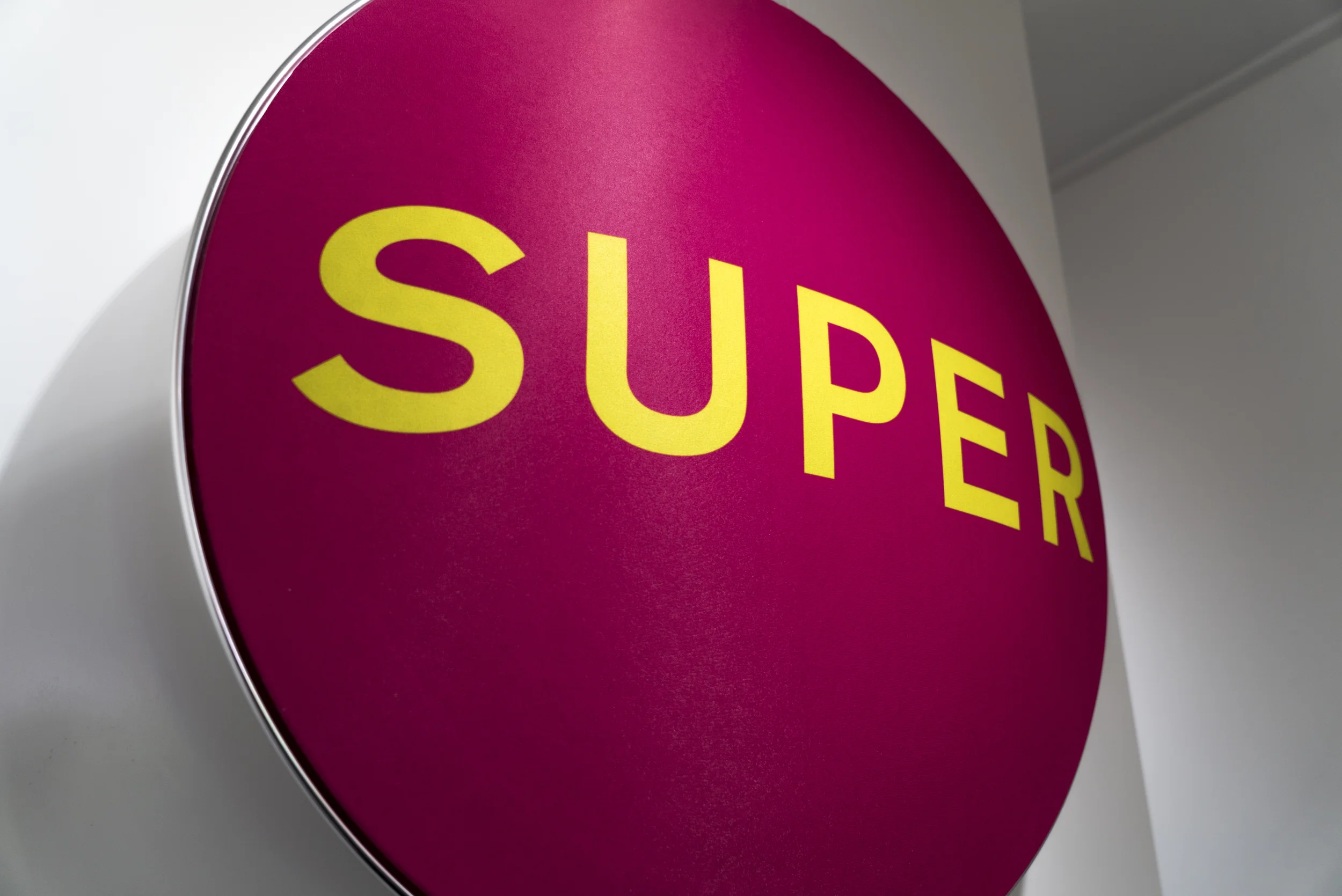
A customised Beoplay A9 with SUPER cover at Boxpark Shoreditch in London
Could you tell us some specific top memories behind the Super project.
It’s particularly exciting when a new Pet Shop Boys project starts. Not least because Neil and Chris are probably the most fun its possible to have in a meeting.
It’s never just an album cover we work on – it’s singles and the advertising, all of which is often followed by a world tour, which means apparel, tour book, posters and so on. So its quite an undertaking. That it has to be strong, simple and memorable is a given, not least now that a lot of music lives on a tiny mobile screen.
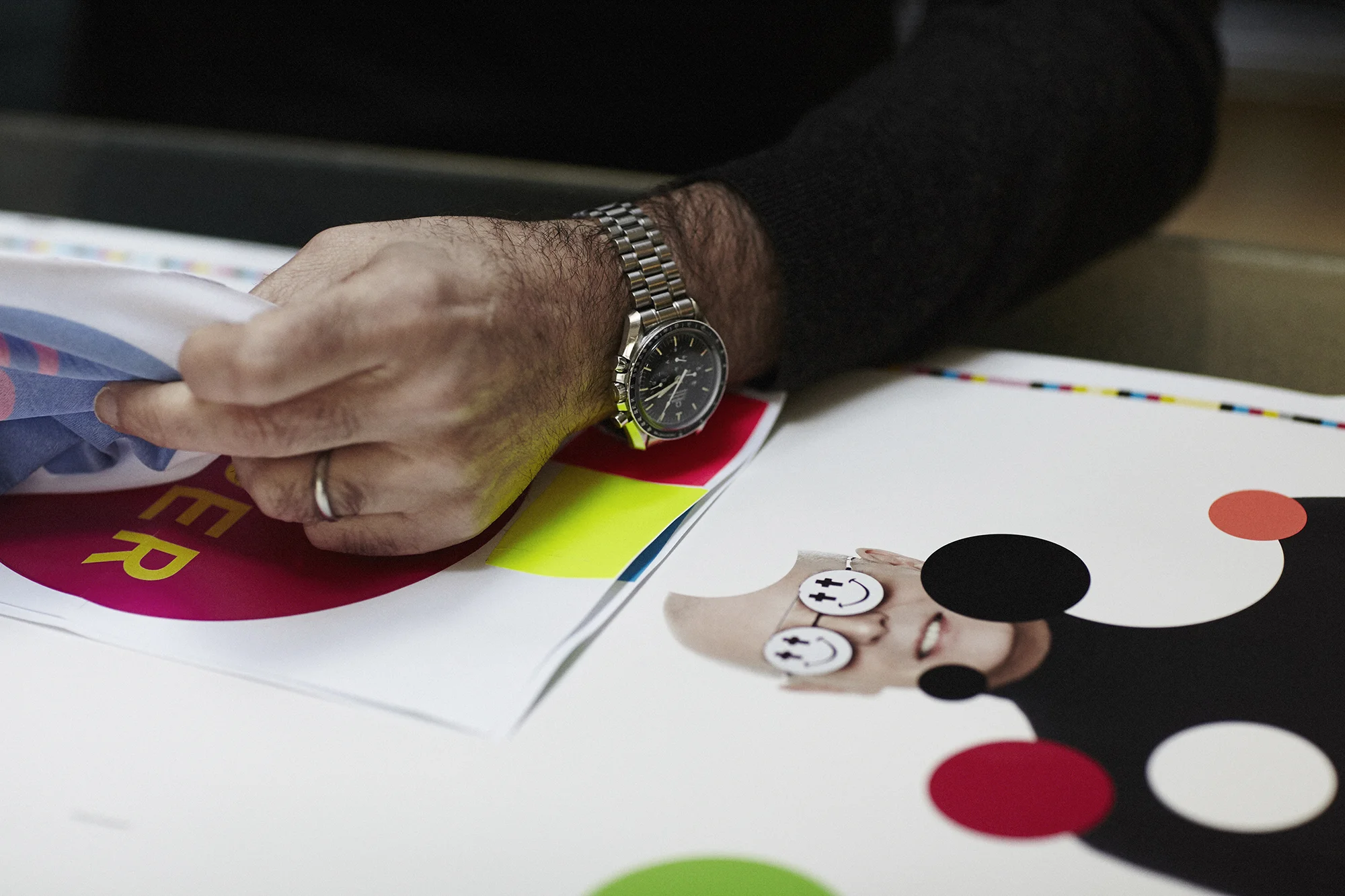
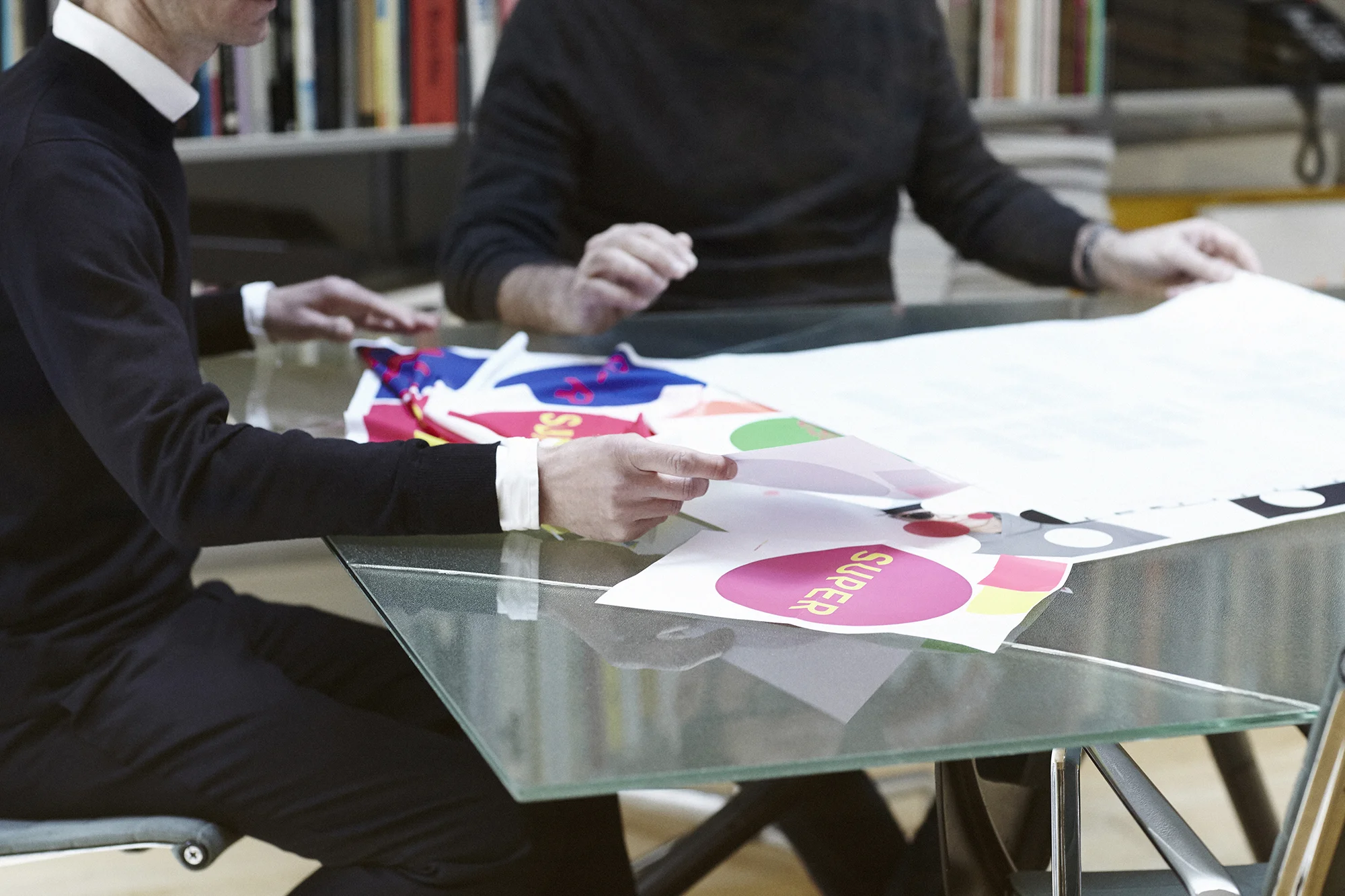
When we first met with Neil and Chris about this album I think they had three possible titles. Of those we liked Super straight away and that seemed to persuade them that it was the title to go with. Neil described this album as feeling a little “unhinged”. Chris said he wanted the cover to be brash. For the last album, Electric, we created what was almost a piece of op-art, a geometric pattern that messes with your eyes when you stare at it. This time we went pop art, a fluorescent circle containing the word “SUPER” in a contrasting fluorescent colour. Then each format, CD, LP and digital, was given its own fluorescent colour scheme. The different music streaming services even have their own colour schemes. These colour schemes then come together in an animation of clashing colours used for online advertising and digital poster sites. Unhinged and brash, yes, but it also feels considered and complete as a campaign.
I heard the other day that Pet Shop Boys have sold 50 million records worldwide. That means an awful lot of people have come in to contact with our work because of the Pet Shop Boys, which is super in itself.


